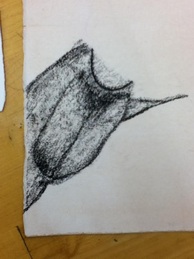
Ok, so we're starting on an Old Masters drawing project in class. We've been given the choice between three types of paper (each with a different level of tooth, or roughness) and charcoal, conte crayons, white chalk, and ink as marking media. I'm imitating the aforementioned Rubens piece in charcoal, and as you can see, I've just gotten started working. Coach suggested that I begin in a corner or otherwise inconspicuous place, so I chose to begin by working on the left calf of the figure in the image. I think it looks ok for beginning work, but as I look at it from a distance, I see lines that are a little too defined to convey a completely convincing sense of depth. I tried to create multiple values by varying the concentration of the mark, but I think that the best way to really bring forward the most salient regions will be to go back over the area and highlight them with chalk, which I'll do as one of the final steps of the project. For now, I'll continue to practice imitating Rubens' mark and creating the illusion of depth as well as I can.
 RSS Feed
